Google Photos is changing up its pop-up User Interface (UI) once again for quick sharing and library management.
This year Google is releasing major updates and redesigns for the Photos app on Android. First, the company announced a big update for the “sharing” section of the app and later rolled out a redesigned Library Tab.
Now, the tech giant is changing the UI of Google Photos. According to the reports by 9to5Google, this change looks like a server-side update on Google Photos version 5.96.
New Pop-Up UI on Google Photos

The report suggests that the new Pop-up UI is seen while selecting photos or videos from the library. However, the change was noticed on a few devices, so the update might be limited rollout or might be at a testing point.
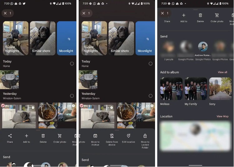
In the latest UI, we can see all the options at the bottom of the screen with “Share”, “Add to”, and “Delete”. There are other options to delete content from the device, order prints, move to archive, and move to Locked Folder.
The new updated UI integrated more options without clicking through to the image.
By swiping up further in the pop-up, one can access direct send shortcuts to specific contacts. Below that, there is a shortcut to add an image or video to the album and also to see the location of the file. All these options also appear while selecting multiple photos or videos.
Currently, it’s unclear whether the latest update is rolling out widely or not. We need to wait for the official confirmation regarding this.
In April, Google completely redesigned the “Library” tab. In this change, Google Photos immediately shows a grid with the 10 recent albums. Including Favorites, Camera roll, and everything else can be sorted by a carousel of filter chips.
With the Sharing tab in Photos, the list is now separated into three distinct sections. There is a shared album, and the list below shows the three most recent “conversations and shared links.
The post Google Photos Brings New Pop-Up UI For Quick Sharing appeared first on TechViral.
from TechViral https://ift.tt/aR58TvA


